Together with certain other boilerplate features, like throwing objects to lure guards out of position, it suggests a studio with little experience of action-adventure clinging zealously to conventions at the expense of its premise. But perhaps the real problem is that nobody really wants to play a genuinely Gollumy game. The whole point of Gollum, after all, is that you try not to become him. He’s the cautionary tale Bilbo and Frodo must learn from during their struggle with the Ring - the Hobbit who fell, his mind and body splitting around a terrible obsession.
On a more prosaic level, casting Gollum in a game where you guide the character from behind seems a waste of his defining features. This is how The Hobbit introduced him, way back in 1937: “a small, slimy creature… as dark as darkness, except for two big round pale eyes in his thin face”. The rest of Gollum’s body is only hinted at, to begin with - most startling of all, if you come to the books from the Jackson films, is the revelation that he has pockets. This ambiguity explains the sheer variety of interpretations of the character by Middle-earth artists over the years: looming Grendel figures, purple lizards and Ferguson Dewar’s affable boatman from 1964, who looks like he’s angling for a New Yorker caption.
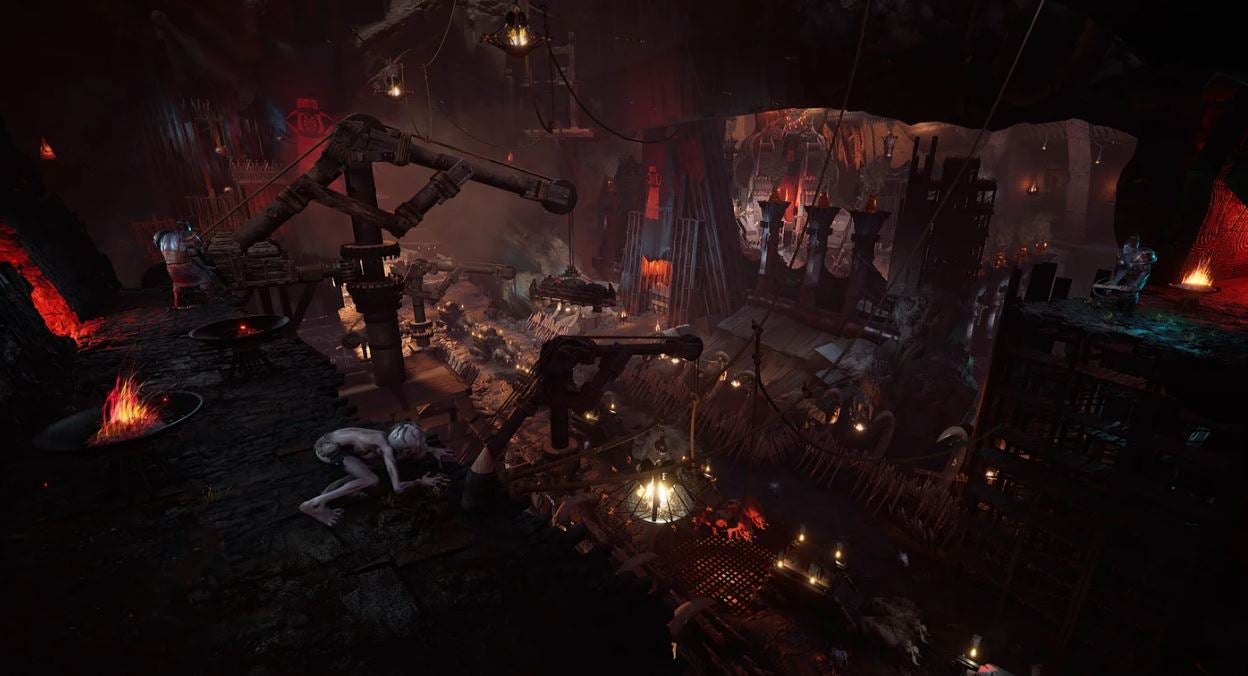
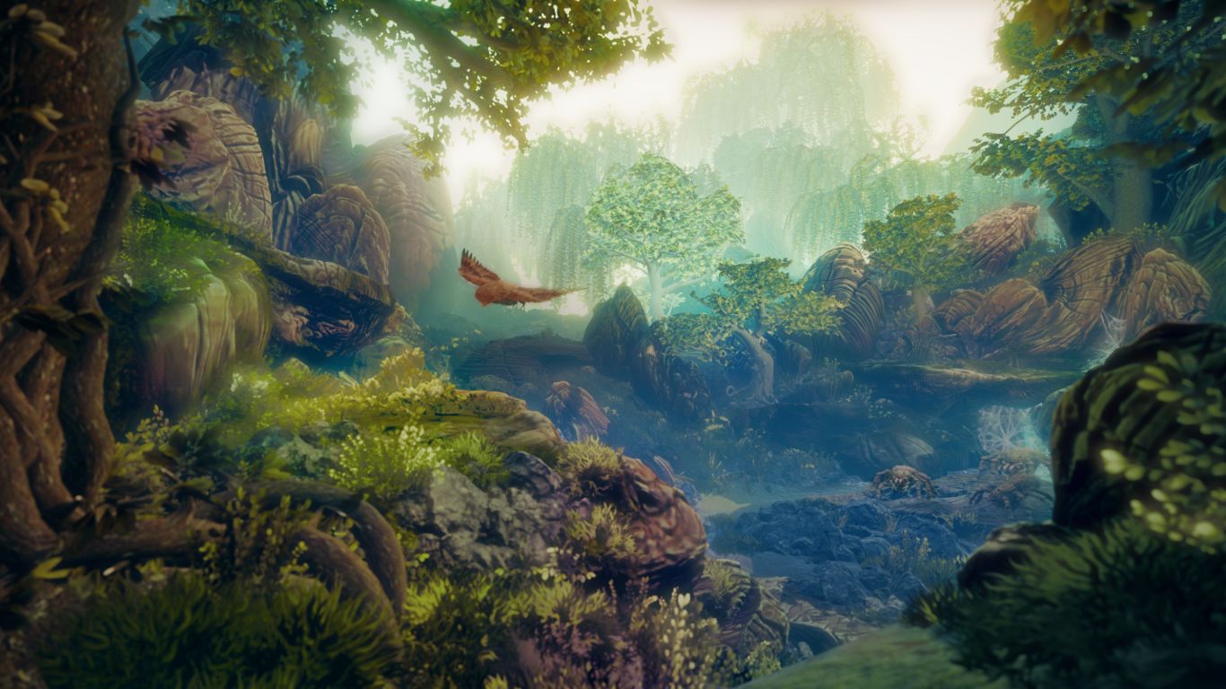
Daedalic’s version closely resembles the Gollum of Andy Serkis, but it’s also an attempt to blend all those different Gollums into something younger and older Tolkienistas might recognise - and in that engagement with the history of Middle-earth in art lies the spark of something wonderful. Gollum is a throwback game in a couple of senses. Firstly, it unfolds before the events of the Fellowship of the Ring, with Gollum separated from his Precious and a prisoner of Sauron’s army in the fortress of Barad-dûr. I haven’t seen this location portrayed so comprehensively in a videogame - indeed, you never really set foot within it in the books - and for those who take issue with the Unreal glower and dinginess of it all, there’s the prospect of lush Elven woodlands down the road. But more important than where it sits in the chronology is Daedalic’s aim to rediscover Middle-earth aesthetics from before the movies - egged on by the license holders at Middle-earth Enterprises, who were impressed by Daedalic’s previous adaptation of Ken Follet’s Pillars of the Earth. Though shaped by the Jackson sextet, its art direction looks back to Tolkien’s original descriptions and moreover, his sketches and paintings - some printed in the books, others drawn as imaginative aids during writing.
It’s this that makes Daedalic’s game most interesting, and this that justifies the choice of Gollum as protagonist, because Gollum is above all a wanderer, propelled through the crevices of a glorious, awful world by his yearning for the Ring, watching from the shadows “with his pale eyes like telescopes”. Casting him as lead is an opportunity to peer deeper into a universe that has become synonymous with cinematic battle scenes (and memes), much to the displeasure of Tolkien’s family. Daedalic’s struggle to fashion a game from those drawings and paintings, meanwhile, reminds us of the complex role illustration plays in Tolkien’s storytelling.
Tolkien could be pretty disparaging of illustrations, and not just because he felt his own talents as an illustrator were lacking. The problem with visual art, he wrote in his celebrated essay “On Fairy-Stories” (PDF), is that it “imposes one visible form”. Rather than turning your mind loose in the enchanted wood, it calcifies the magical world into a single thing. Written description, by contrast, “is at once more universal and more poignantly particular. If it speaks of bread or wine or stone or tree, it appeals to the whole of these things, to their ideas; yet each hearer will give to them a particular personal embodiment in his imagination”.
Perhaps as a consequence of this view, Tolkien’s illustrations have a powerful irresolution. Influenced by Art Nouveau and Japonisme, they favour landscapes over figures and strike a balance between naturalistic proportions and the mazy regularity of a stained-glass window. Just look at the original 1937 dust jacket design for The Hobbit, with its serried negative spaces and eerie, Uccello-esque withdrawal of trunks and embroidered foliage towards the maw of Erebor on the spine. These artworks don’t feel like settled views, but glimpses of a world he was struggling to enter and as such, invitations to the reader to fill in the picture. They are carefully entwined with the prose, and not just in terms of where they appear in the published books. As Anna Smol argues, Tolkien writes like a painter - his landscape descriptions are typified by “the use of some basic colours modified by qualities of light, along with an artist’s attention to the composition of the image”. I would argue that he also draws like a writer, with sketches sometimes appearing to grow from letters during initial composition, squeezing their way out of paragraphs like germinating seeds.
Consider this handwritten manuscript page for The Return of the King, describing Sam’s first clear look at the tower of Cirith Ungol after Frodo is taken prisoner on the outskirts of Mordor. Tolkien emphasises the tower’s height by way of its tapering shape, with “pointed bastions of cunning masonry […] diminishing as they went up”. Gazing at it, Sam experiences a “sudden shock of perception”: the tower, originally raised by the forces of Gondor after Sauron’s first fall, “had been built not to keep people out of Mordor, but to keep them in”. Readers are in for a “shock of perception” themselves. The manuscript includes a pencil sketch of Cirith Ungol down the left hand margin, but rather than being neatly boxed off, the image intrudes upon the text, its fortifications lining up against the prose. As the writing descends the page, it is shunted sideways by the expanding mass of the drawing, compacted against the righthand margin, as though Cirith Ungol were crushing and choking attempts to recall it in words.
Which came first? Did Tolkien draw the tower in order to describe it better? Or did the image appear of its own volition during writing? Look closer, and you’ll see that the line of the cliff behind the tower appears to emerge from the middle of the very sentence describing it. Perhaps the drawing began life as nothing more than a pencil stroke out of place.
Daedalic’s game is built around a similar, albeit more pragmatic tension between artforms - the weirder intricacies of Tolkien’s aesthetic versus the needs of videogame exploration and traversal. Tolkien’s landscapes, art director Mathias Fischer told me back in 2019, are made up of “parallel lines that fly into each other, building bigger structures”. I love this phrase, with its quasi-Sublime sense of the world as an on-going encounter between wood and water, stock and stone, frozen by the glance of the mortal onlooker. Once you start looking for those flying parallel lines, it’s hard to stop. Take Tolkien’s drawing of the view east from Rivendell, in which sky, cliff and forest seem charged with the joyful energy of the river curving through them. As Fischer noted, “it’s like the illustrator gets lost in some corner of his world”. But Daedalic doesn’t want you to get lost in the game: the challenge is to fashion navigable spaces from those hyperactively worked surfaces. This sounds like it’ll be easier in Barad-dûr, a built world of cranes and furnaces, fortresses within fortresses housing sleeping quarters and kitchens - strange little oases of Orc domesticity, where iron and steel fittings emphasise routes and entrances.
There’s also the question of light and colour. Tolkien painted some lovely night skies, but his pictures are rarely dark or obscure; like Galadriel, they have a lethal, faerie lightness, with unearthly watercolours seeming to disappear into the canvas. The author’s painting of Barad-dûr’s exterior is a far cry from the film - all gaseous greens and Victorian brickwork, with a fitful twist of lava in the bottom corner, like a motorway through drizzle. Daedalic’s version is more in keeping with the movies and the volcano levels of other games, but there’s a reason for that - at this point in the narrative, Gollum is without his invisibility-conferring Ring, and a stealth game needs its shadows.
These environments shape their creatures. The Orcs of Sauron’s tower, born and raised in a lightless abyss, have been hewn and worked like stone, their pale skin and armour decked with close-nested curves. I haven’t laid eyes on the Elves you’ll meet later in the game, but they’re said to live closer to the soil than their cinematic brethren. The star performer is presumably Daedalic’s rendition of Thranduil, Legolas’s dad, who appears in concept art as something like a dryad, with a branching crown that changes according to the season and flowers sprouting all over his body.
Flowers! Curves! Unearthly watercolours! Phew. Time will tell whether these excavations of Tolkien are compensation enough for the more routine aspects of the game, but I’m already glad to be having the conversation. Because the contraction of a fairy story into “one visible form” doesn’t just ruin the magic; it’s part of the process by which fictions become franchises that resist experimentation and change. Nowadays, the look and feel of The Lord of the Rings is the look and feel of the films. Other traditions of Middle-earth art, from Cor Blok’s minimalist renderings to Robert J Lee’s Hobbit scenes for The Children’s Treasure of Literature (summarised by Tolkien as “vulgar, stupid, and entirely out of keeping with the text”), have been banished.
Once beings of myth and archetype, Tolkien’s characters are now real-life celebrities and everlasting internet characters that weave an irresistible spell. In themselves, the New Line film aesthetics are mesmerising; developed in partnership with seasoned Tolkien illustrators Alan Lee and John Howe, they are a loving and comprehensive exploration of a world whose after-image appears in thousands of works of fantasy literature. The problem is more to do with the basic dysfunction of capitalism, with its tendency to over-concentrate value and bulldoze alternatives. One aesthetic to rule them all.
This is something we see in videogames too. Take the Mass Effect remaster, which “beautifies” many of the original game’s artistic choices in obedience to the march of graphics hardware, or Nintendo’s remake of The Legend of Zelda: Link’s Awakening, which (to my eye, anyway) reinvents one of the sadder Zeldas as a piece of plastic merchandise. Again, these projects may be captivating in themselves; the problem lies with presenting them as the “definitive” representation of the fiction, the only one worth experiencing. I don’t want to position Daedalic’s Gollum as some kind of radical resistance to all this - at the end of the day, it’s a corporate artwork, and let’s not forget, it has a wall-run. But as with demaking, it’s a reminder that there are many ways of describing, picturing and entering even a world of this commercial stature - and an engrossing exercise in finding out what happens when, like Tolkien, you weave two very different artforms together.


