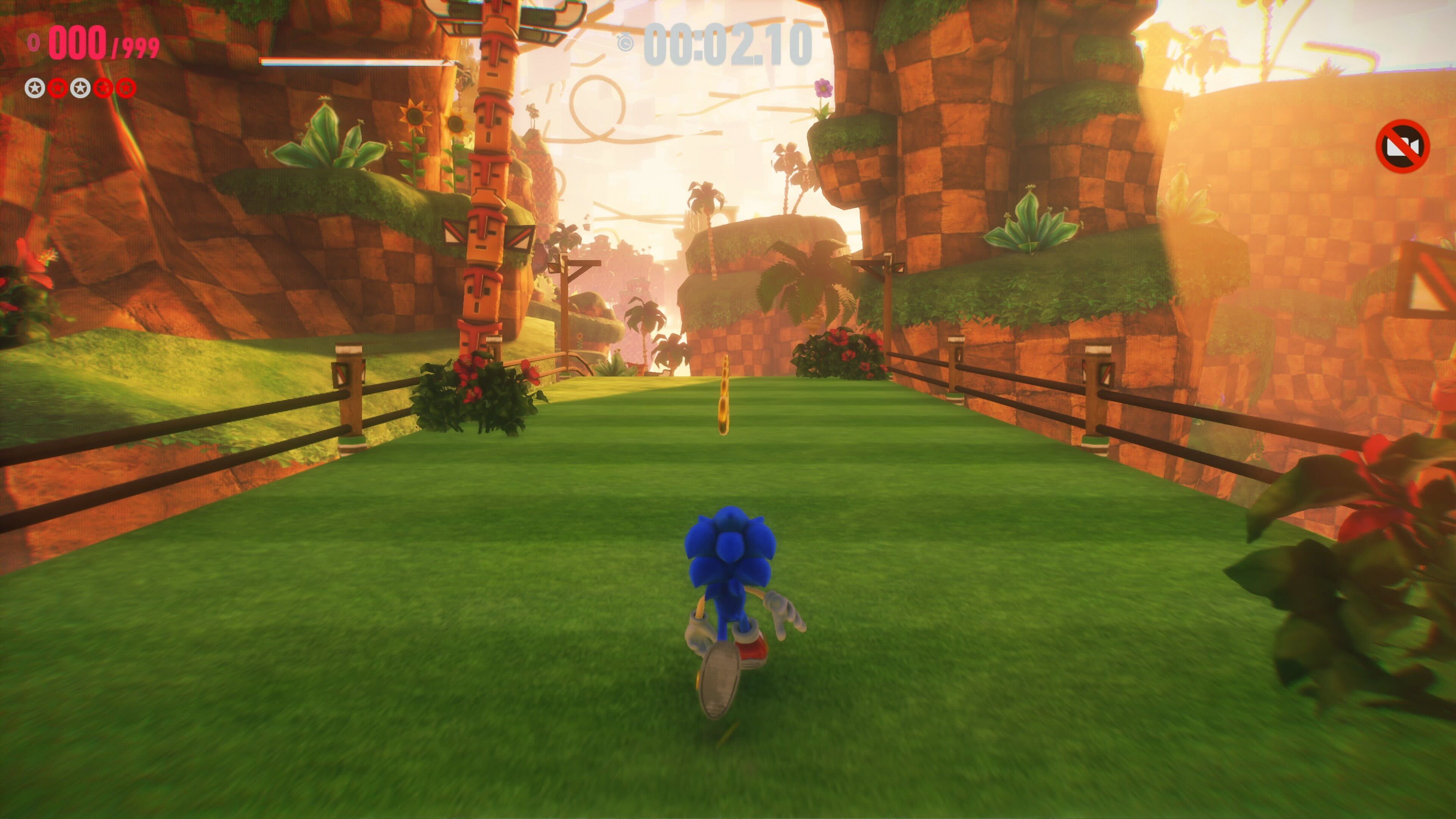
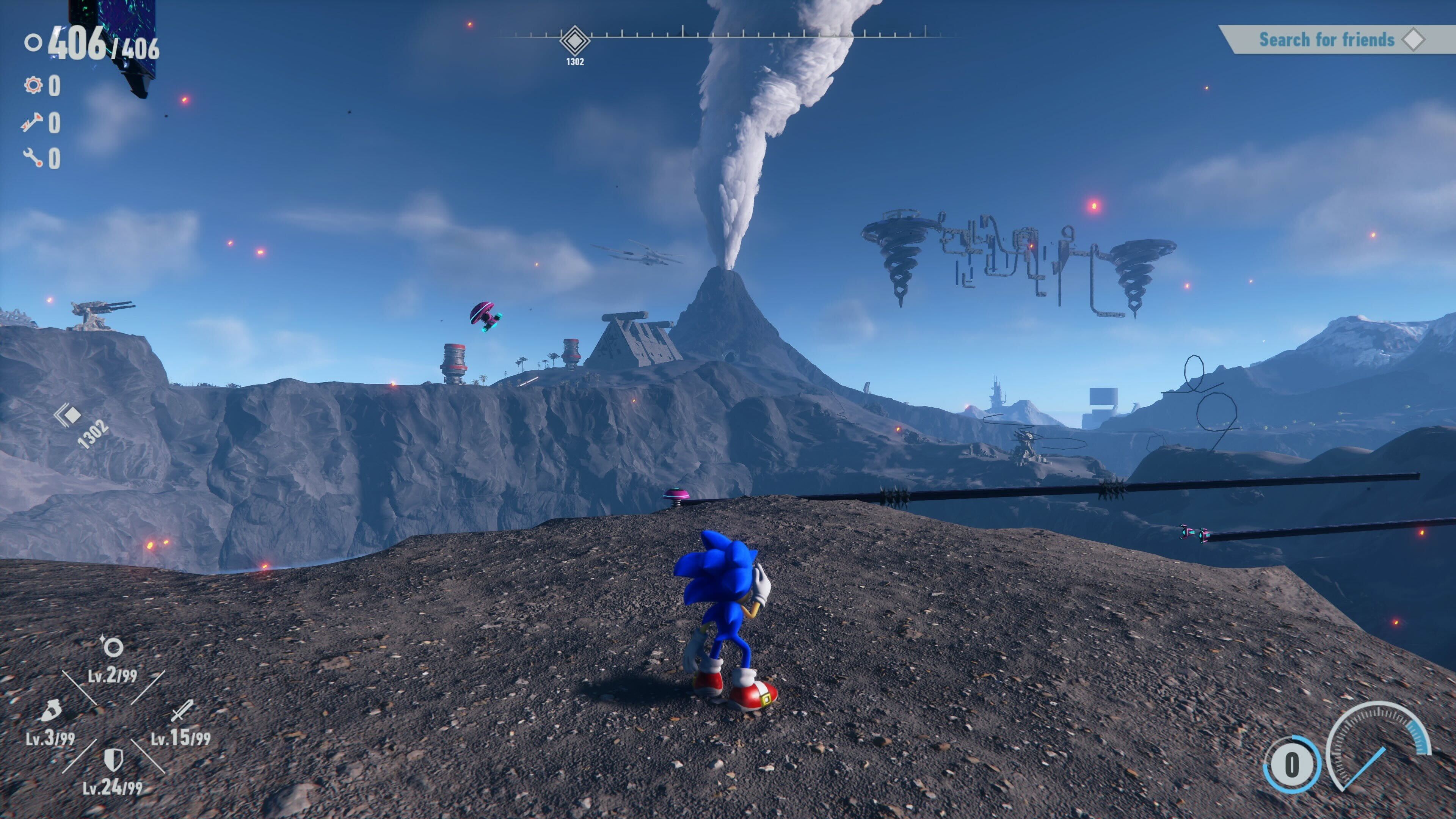
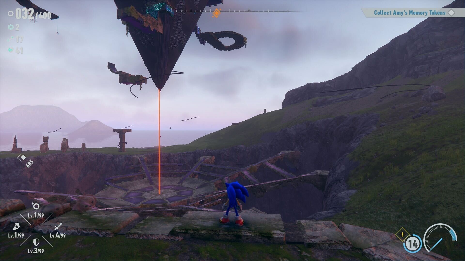
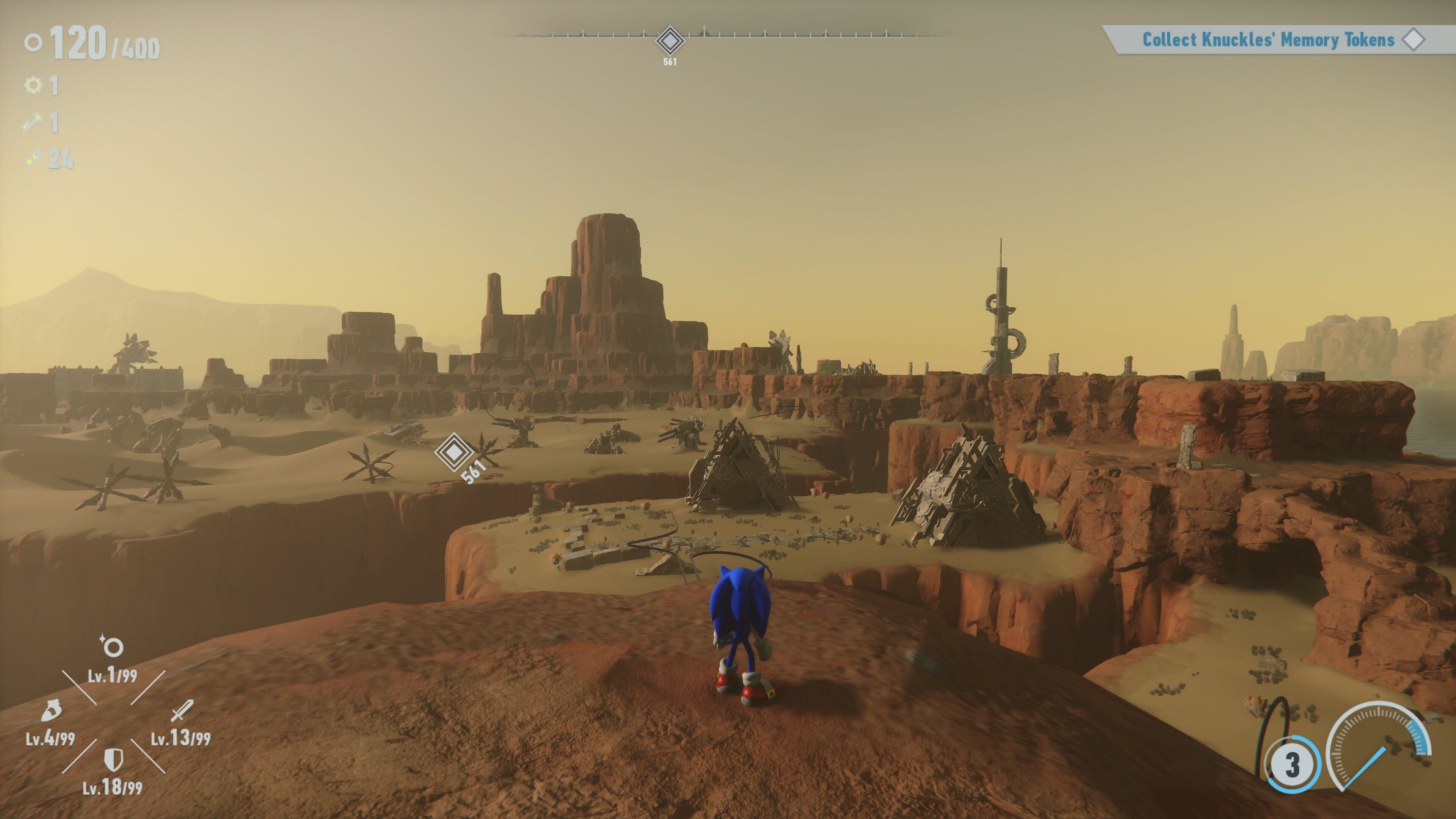
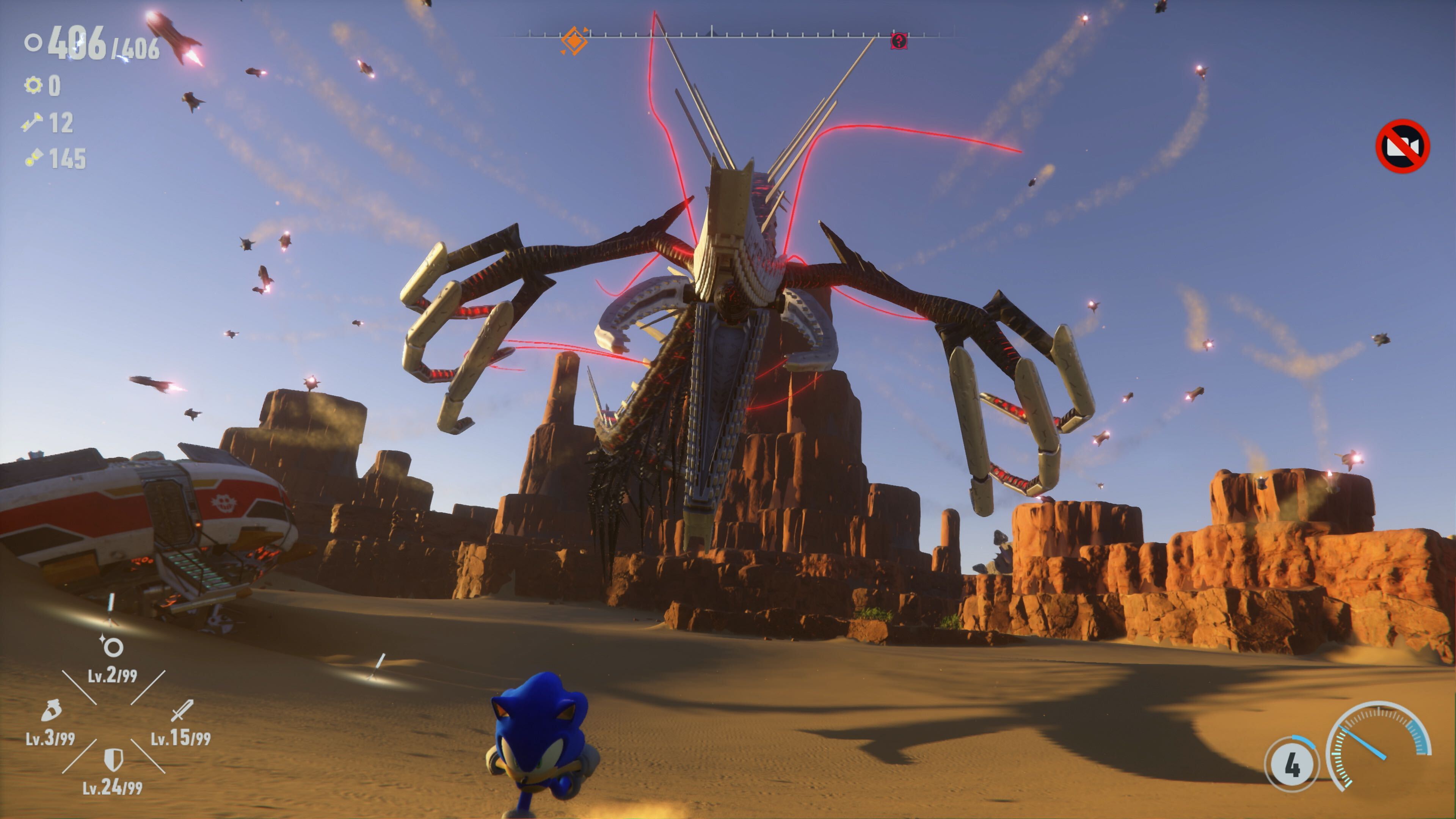
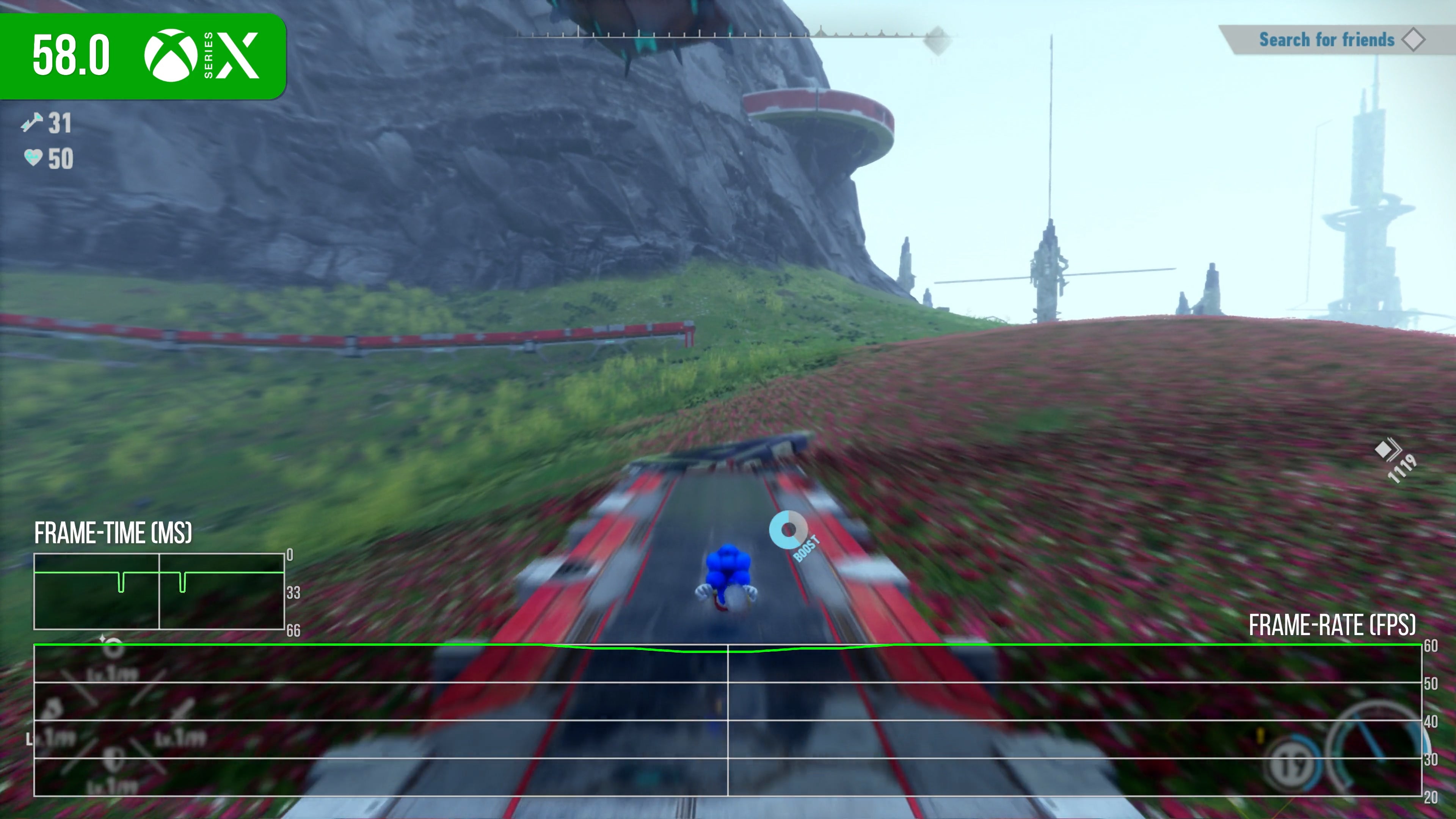
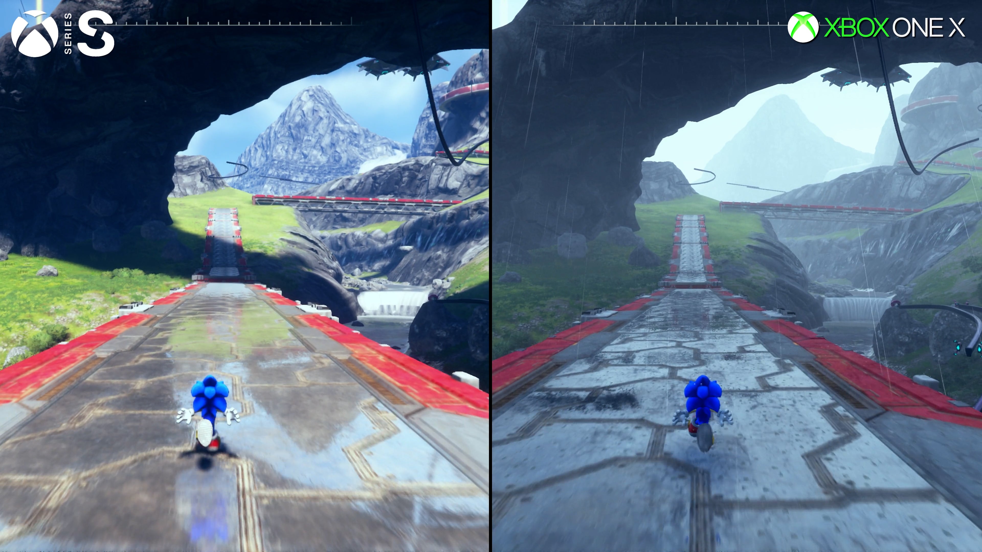
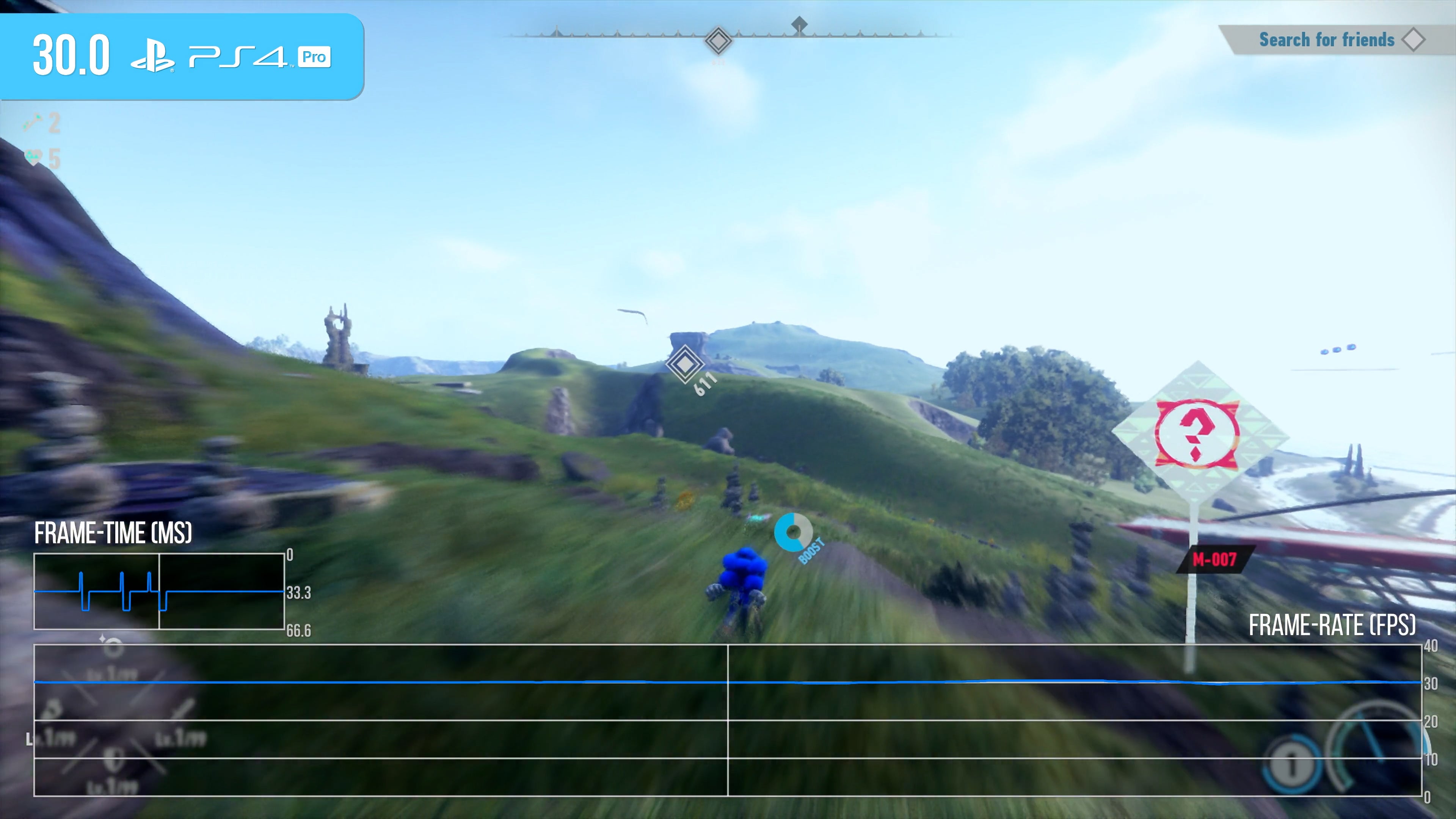
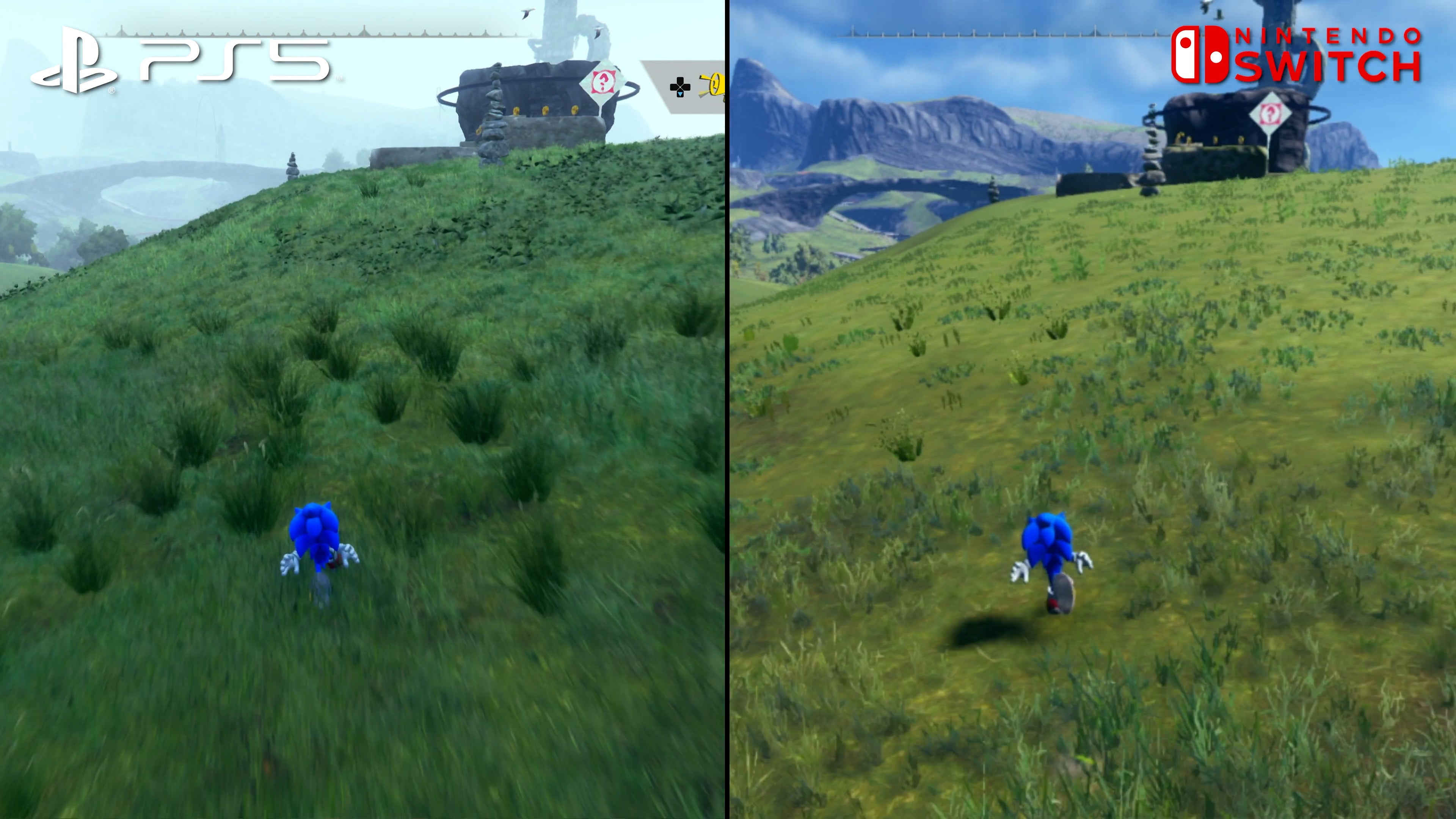
As a Sonic fan, I have much to say about the game design - and all of that commentary is in the embedded video below - but for the purposes of this piece, I’m going to focus on the core technology and the best way to play. At its core, Sonic Frontiers is powered by Sonic Team’s internal Hedgehog Engine 2 - the latest iteration of the technology that debuted in Sonic Unleashed. This time, the team was challenged with building much larger environments than any prior Sonic game, while implementing a full time of day cycle complete with an impressive global illumination solution and long-distance shadow rendering. The result is far from perfect but, overall, it works. There are a lot of good things to say about Frontiers visuals but, at the same time, its flaws are egregious to the point where I should probably discuss them first. The most serious issue with Sonic Frontiers stems from the way it handles object draw-in. Sonic Frontiers exhibits some of the worst pop-in I’ve personally witnessed in a modern game. Running across the terrain, it’s difficult to ignore entire structures, platforms and foes popping into view from nothing. The primary issue is that while the engine does have an LOD system - which is used for certain types of terrain detail - many objects do not have an appropriate LOD or imposter assigned to them so rather than fading from a low detail version of a model to a higher detail version, they simply pop into existence. The games doesn’t even bother with dithering or blending the transitions - objects suddenly appear out of thin air every time. This is the most serious issue, but I also found that when running across rough terrain, movement can appear jittery, while you’ll equally run into occasional issues with collision - especially when dealing with larger foes. Furthermore, the rain effect can appear rather ugly at times with a layer of small white dots representing droplet intersections. There’s much to critique then, bu thankfully, most of the rest of the package impresses. Character rendering is top tier - Sonic retains his expressiveness from other recent games but exhibits more detail and nuance in his design. The animations both during cutscenes and gameplay are generally quite good. The world, while full of pop-in, still impresses especially in terms of lighting. This has always been a strong point for the Hedgehog Engine dating back to Unleashed, and it’s great to see Frontiers pushing this forward with a real-time time of day system that still retains the excellent light bounce and colour transfer properties it’s known for. The quality of the physically-based materials is also a standout - rock, stone and metal all exhibit shockingly realistic properties which, when combined with the lighting and model quality, can sometimes resemble an offline render. Furthermore, distant shadowing is present allowing large vistas to retain their depth. There are plenty of environmental interactions as well which enhance the experience - foliage reacts to Sonic’s movement; normal mapped water ripples respond to your footsteps while trails are left behind as you cross the sandy desert. Per-pixel motion blur is also used throughout applying to both the camera and characters alike. Cyberspace levels are generally appealing aesthetically speaking. Assets are liberally borrowed from Sonic Generations, but the actual layouts differ more than I had expected - most of these stages are fresh and new in terms of design. Honestly, the visuals in Sonic Frontiers mirror the game design in the sense that they’re exceptionally interesting but uneven. I really can’t say enough good things about the lighting model and expansive vistas but it’s a shame Sonic Team wasn’t able to get the pop-in under control by release. With the game shipping on so many platforms, however, I’d imagine even reaching this point must have been challenging. As a cross-gen game, Sonic Frontiers is available on PlayStation 4 and 5, every Xbox since Xbox One, the Nintendo Switch and PC. That’s nine versions of the game - perhaps even 10 if you consider the separate portable mode on Switch. So, to break this down simply we’ll start with the best console version of the game and work our way down - the best and worst aren’t unexpected, but the order might surprise you. For the best experience on consoles, you’ll want to play on either PlayStation 5 or Xbox Series X. They are virtually identical on every front - they use the same visual settings, feature the same modes and resolution options and both look great. By default, the game begins in its 4K resolution mode which, unsurprisingly, delivers a native 4K image, albeit with a 30 frames per second cap engaged. Once you’re given control, I recommend immediately hopping into the options menu and enabling the 60 fps mode instead. Contrary to pre-release rumours, this mode seems to offer a dynamic 1800p presentation which, when coupled with their excellent new TAA solution, offers surprisingly crisp image quality and a target 60 frames per second frame-rate. Why this isn’t the default setting is baffling to me as the game instantly looks and feels dramatically better at a higher frame-rate. This goes doubly so when we examine performance. You see, the 30fps cap has a problem - Sonic Frontiers exhibits inconsistent frame pacing in this mode, meaning obvious jerkiness in performance. The 60fps mode, however, fares much better. The Cyberspace stages are virtually flawless on both machines - fast and fluid from start to finish. The islands, however, can exhibit minor dips: slightly annoying, but cleaned up completely if your screen has VRR support. The one caveat here is that cutscenes are all played at 30 fps for some reason and, as a result, the frame pacing issues rear their ugly head anytime a cinematic is played. So, if you’re trying to decide between PS5 or Xbox Series X, well, it’s all down to controller preference more than anything. Our next stop is Xbox Series S and Xbox One X. The Scorpio machine offers a higher resolution than Series S but today’s junior Xbox matches its bigger brother in terms of visual settings - swings and roundabouts then. Basically, on Xbox One X, the game seems to use a dynamic 1800p resolution while Series S instead targets 1440p so the older machine produces a sharper image. However, if you look closely, you’ll spot some visual discrepancies - trees, for instance, are fuller on Series S along with other benefits like superior screen-space reflections. However, pop-in seems to be roughly the same between the two and there aren’t that many other visual flourishes so they wind up looking pretty similar overall. The real disappointment stems from its performance - Series S lacks the 60fps option available on Series X, so you get the same poorly frame-paced 30fps mode instead. That same performance profile applies to Xbox One X too - but at least they stick to 30fps, even if it does present in a somewhat wobbly manner. That’s not to say Series S doesn’t have some advantages - the most significant boost is loading. Next up on the version rundown are PS4 Pro and PS4. Both versions seem to aim for 1080p so they’re much lower resolution than the other versions we’ve already examined. In fact, the numbers seem to line up with Sonic Forces to some degree as the PS4 Pro support in that game was also limited. They also use the medium quality settings like One X and both are capped at 30 frames per second. In this regard, PS4 Pro does take the lead overall as it holds the 30fps target more consistently versus base PS4 which does tend to drop frames here and there - however, once again, the 30fps cap comes replete with inconsistent frame-pacing, ruining the fluidity. So how about the Xbox One S? This turns in a slightly lower resolution topping out at 900p, it seems, and it uses the lower quality settings like Xbox One X so trees are less detailed than PS4 like this while SSR is reduced in quality. It’s OK but it’s not great. Poor frame-pacing? Of course, it’s there. At the bottom of the barrel we find the Nintendo Switch version. The action stages look and run about as well as you might expect on Switch. Yes, the resolution is in 720p territory when docked and closer to 480p when in handheld so it’s very blurry, but it still looks comparably OK. The one thing missing here is that the global illumination pass has been removed during these stages so lighting is less robust overall but, again, not unexpected for Switch. The situation is far less impressive on the various islands. I expected a downgrade but the loss in visual fidelity is severe to the point where I find it exceptionally distracting. The world is extremely blurry, textures are reduced in quality and pop-in is beyond atrocious. It’s not good in other versions but detailed is pared way back on Switch to the point where it just looks empty. Grass draws in right in front of Sonic to the point of distraction. Global illumination is restored, at least, but the data is in monochrome, so you don’t get the nice colour transfer and natural bounce of the other versions. It just looks a lot plainer overall. The changes don’t stop there. Motion blur seems to be completely disabled which reduces overall fluidity of the game, normal-mapped water ripples are completely gone, trees and other details use ’lower than low’ settings, transparency effects are ultra low res and chunky while screen-space reflections are lower in quality while docked and removed completely in mobile play. Adding to list of grievances you’ll find pre-rendered video quality objectionable, while loading times are more similar to a console with a mechanical hard drive. Alas, when we get to performance, things are even less appealing. Frame-pacing issues remain like every other 30fps version of the game but they seem slightly worse overall. Furthermore, the frame-rate regularly slips just below 30 fps further increasing the judder. The action stages definitely perform best but they’re still less fluid overall than any other version of the game and, without motion blur, appear rather stuttery. The island areas are obviously the worst, and I’ve only had a chance to test the first area - I’d imagine it gets even worse in later areas given the increase in complexity. Nobody expected Switch to match the more powerful consoles and I think the developers mostly made the right choices in terms of what to cut but the cuts are deep enough that it begins to hurt the overall experience. This isn’t like a retro game kind of situation either - you can tell the game was not built with this hardware in mind and getting it to work at all was clearly a big task. If this is your only option, it can still be a fun time, but this is not how I’d want to enjoy Sonic Frontiers. I also spent a little time looking at the PC version, which is both great and mediocre at the same time. If your PC is capable enough, the game runs at 60 frames per second and everything looks and works the way you’d expect. There’s zero shader compilation stutter so no #StutterStruggle to worry about, loading is ultra fast, frame-rates are super-consistent and controls responsive. It even plays well with a mouse and keyboard, if you can believe it. However, scalability is barebones to say the least with little in the way of settings. There’s no ultrawide support, while frame-rate is capped at 60fps max. The PC version also doesn’t fix any of the issues inherent in the console release - the highest settings are on par with PS5 and Series X while pop-in issues remain the same. I do have it on good authority that the modding community is already tearing into this game - removing frame-rate caps, fixing ultrawide support and adding features so I suspect this version will become something special in the future. Sonic Frontiers is not without its issues, but I’m a fan of the game and would highly recommend it to PC, Series X and PS5 gamers. The open zone design is surprisingly engaging without becoming tedious, the action feels tight and satisfying and the challenge level is perfect. I also love what feels like a wink and a nod towards Sonic Team’s NiGHTs into Dreams with the Cyloop power that allows Sonic to draw circles of light around enemies and obstacles. onic Frontiers is just such a fascinating release all around - there’s really nothing else quite like this on the market. It feels fresh and fun in a way that we rarely see these days in the AAA space. Granted, it has plenty of rough edges including pop-in and sometimes fiddly controls but, if you can overcome these issues, I think there’s just a lot to love here. It won’t click for everyone but if it does, you’re in for a real treat.
